In this blog I am going to show a few optimisation case studies, using the SAP’s standard inventory performance graphs. It is definitely a case of a picture is worth a thousand words.
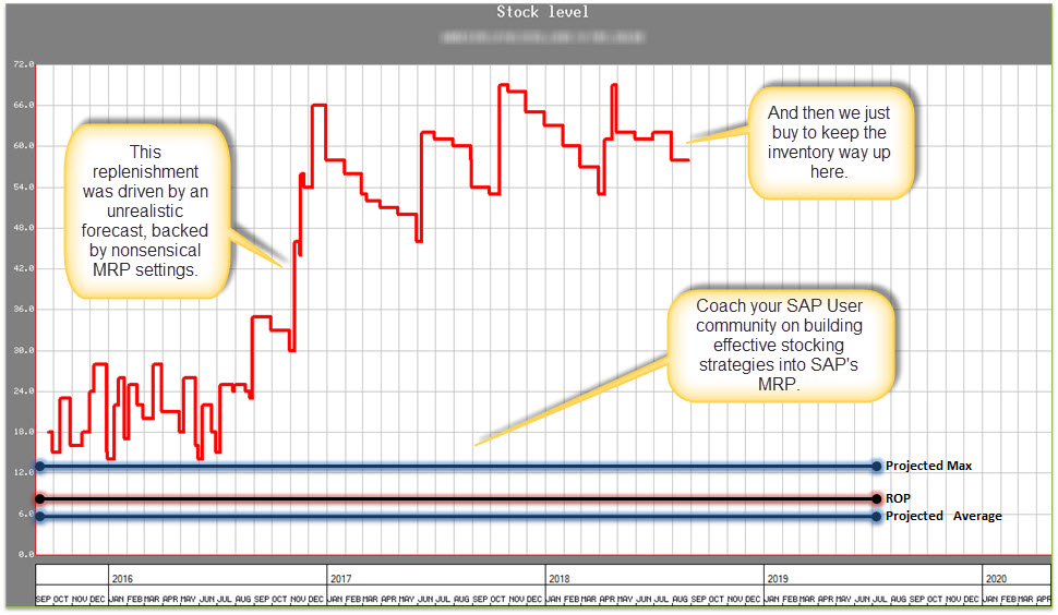
Way too much stock
I used this graph at a client to show how their inventory was spiralling out of control. When you engage the planners, end users, buyers, and warehouse, the explanations will abound. I sometimes call these explanations “excuselitus”, which is a little unkind, since people very often do not know what they do not know. Unpacking the SAP facts behind this graph allows us to set action plans to encourage best business behaviour, set sound stocking strategies in MRP and then to adhere to these strategies (click here to read more about what will happen if you don’t get MRP working).

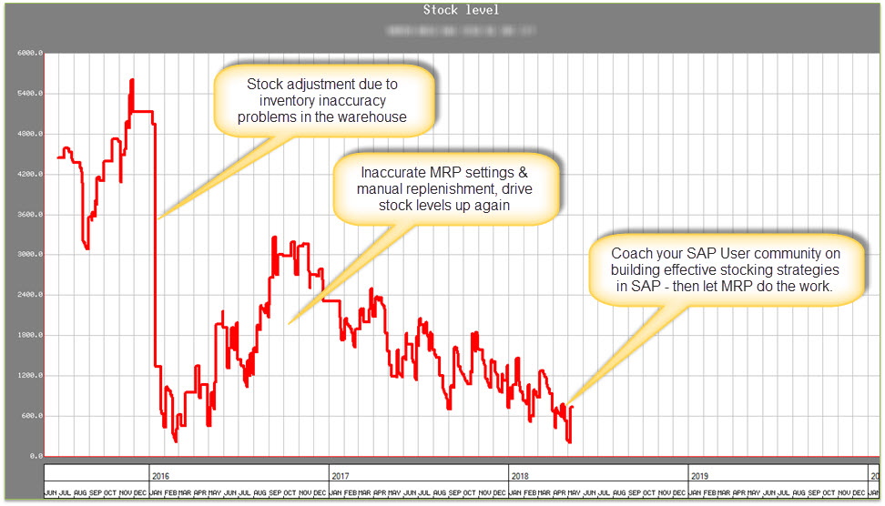
Let MRP do the work
This Graph shows the potential of getting SAP’s MRP to do the work. The “excuselitus” must be unpacked, the stocking strategies captured in SAP’s 4 MRP views, and then MRP must drive replenishment signals to your planners and buyers, based on these stocking strategies, consumption and demand (click here to read more about a view on what you need to do get MRP master data right).

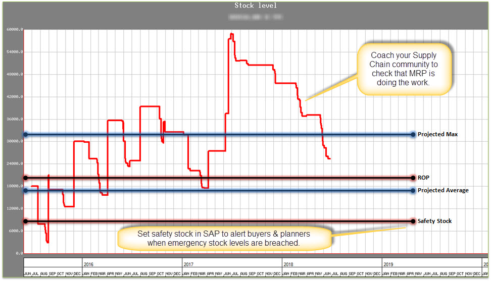
Learn to monitor that MRP is doing the job
It isn’t good enough to update the MRP settings and then to forget about them. It is imperative that your supply chain communities are taught to monitor inventory performance. They need to check that the MRP settings are working – every single day. Clearly we don’t have the bandwidth to check every single updated material, every single day – and so we must rely on SAP’s standard Supply Chain Exception Monitors, which help you focus only on the stuff that’s not going to plan, instead of everything (click here to read more about setting up daily Supply Chain Routine).

